01
The core challenge we aimed to address is the news overload and disorganization that Generation Z faces. This issue stems from a lack of clear guidance on managing news sources, making it difficult for Gen Z to stay personally informed about current events. Additionally, this problem endangers everyone's ability to be well-informed, which is essential for civic engagement and public discourse.
My Role : UX Design and Research Lead , Product Lead
Duration : 10 weeks Team : Shruti, Tanishq, Carlos, Sree
Software : Figma , Miro , Illustrator, Photoshop & Adobe Premiere Pro
The Problem
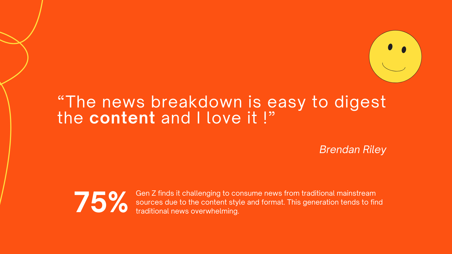
Gen Z is more likely to skim headlines or short social media posts rather than reading in-depth news articles. This leads to a gap in awareness about broader world news & political developments.
Who Are The Users ?
We're all about reaching Gen Z Explores who crave quick, engaging news updates, and the passionate reporters who bring those stories to life on our platform.
The Solution
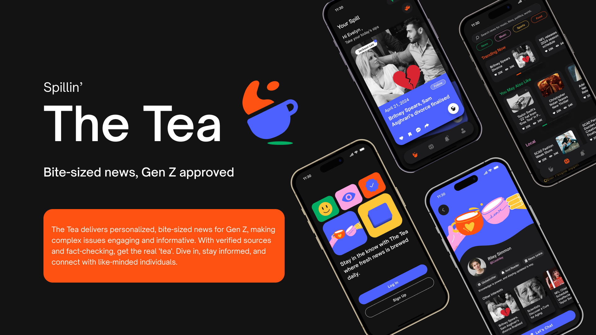
The Tea is revolutionizing news consumption for Gen Z through its multifaceted platform. By offering personalized, bite-sized content, it presents complex issues in an engaging and easily digestible format. Committed to accuracy, The Tea employs verified sources and rigorous fact-checking to deliver authentic news—or the real 'tea'—to its users. This comprehensive platform enables users to immerse themselves in current events, stay well-informed, and connect with others who share their interests, all within a single, dynamic application.
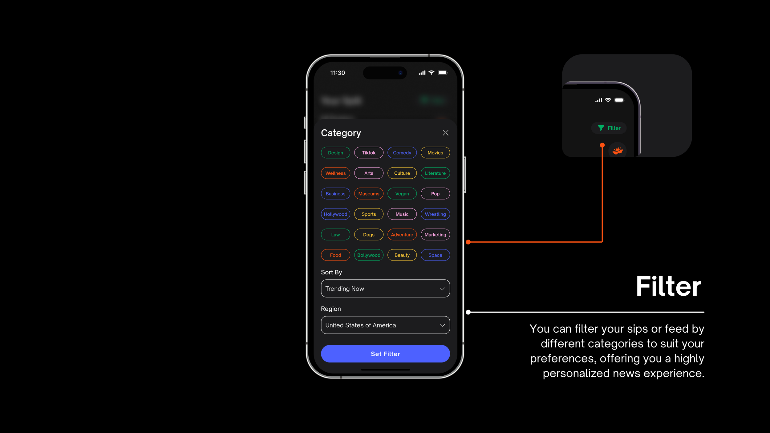
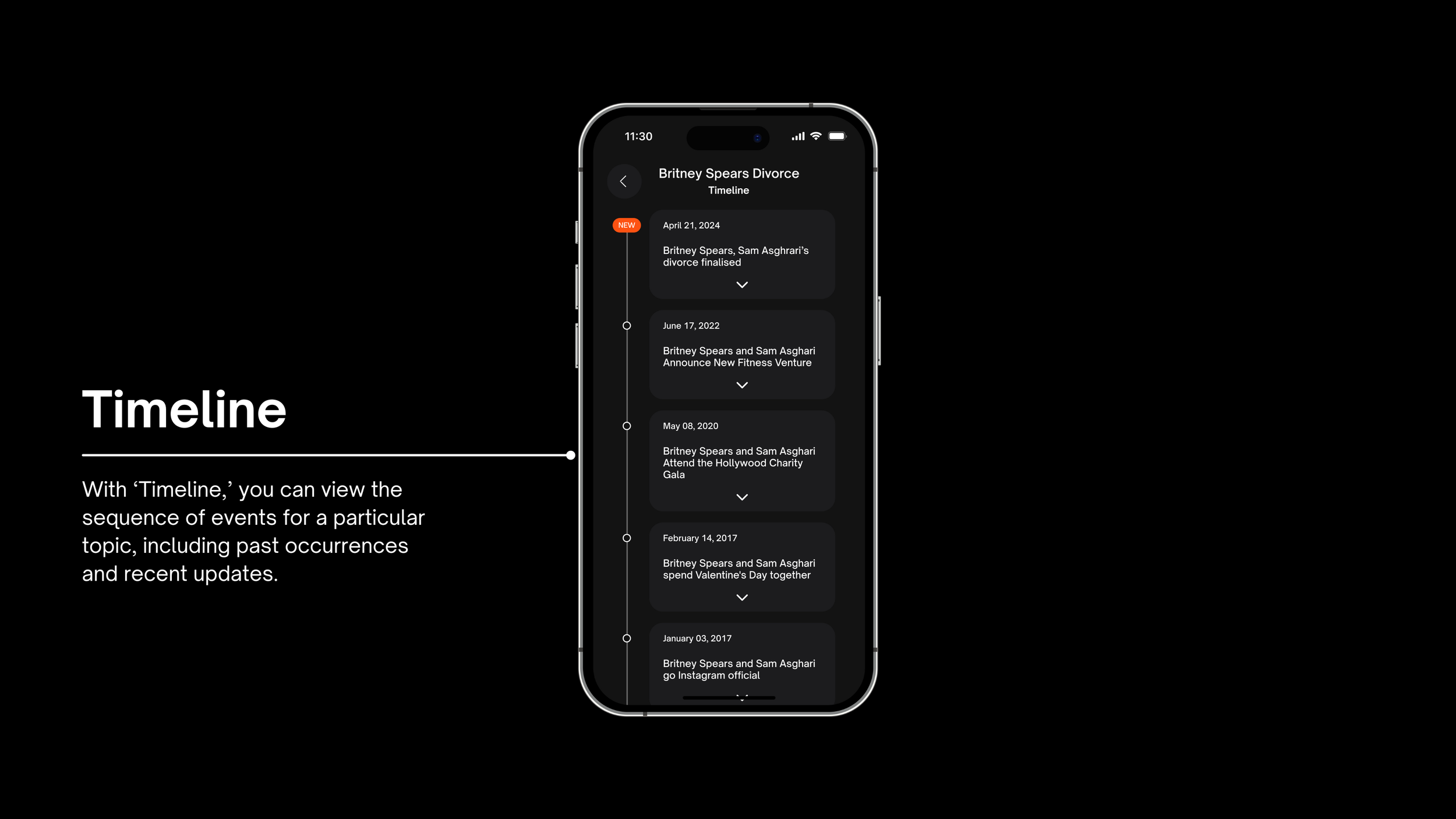
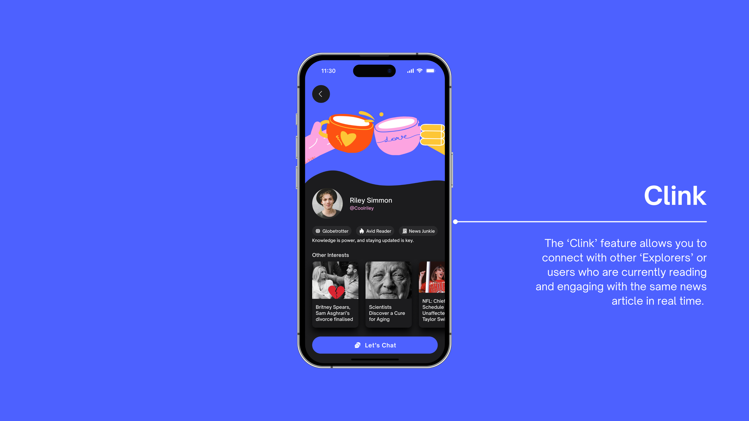
Gen Z Explorers Core Features.
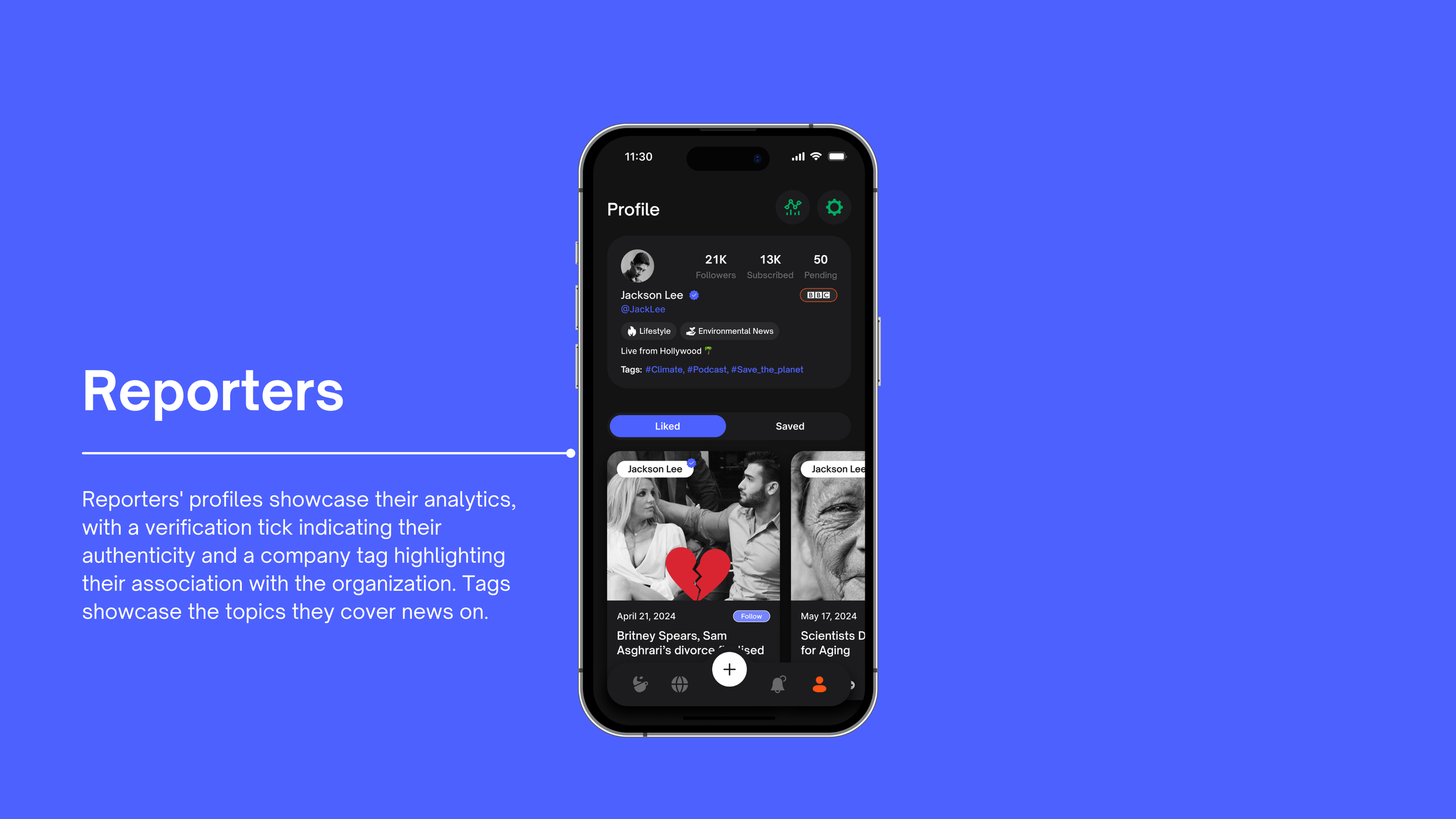
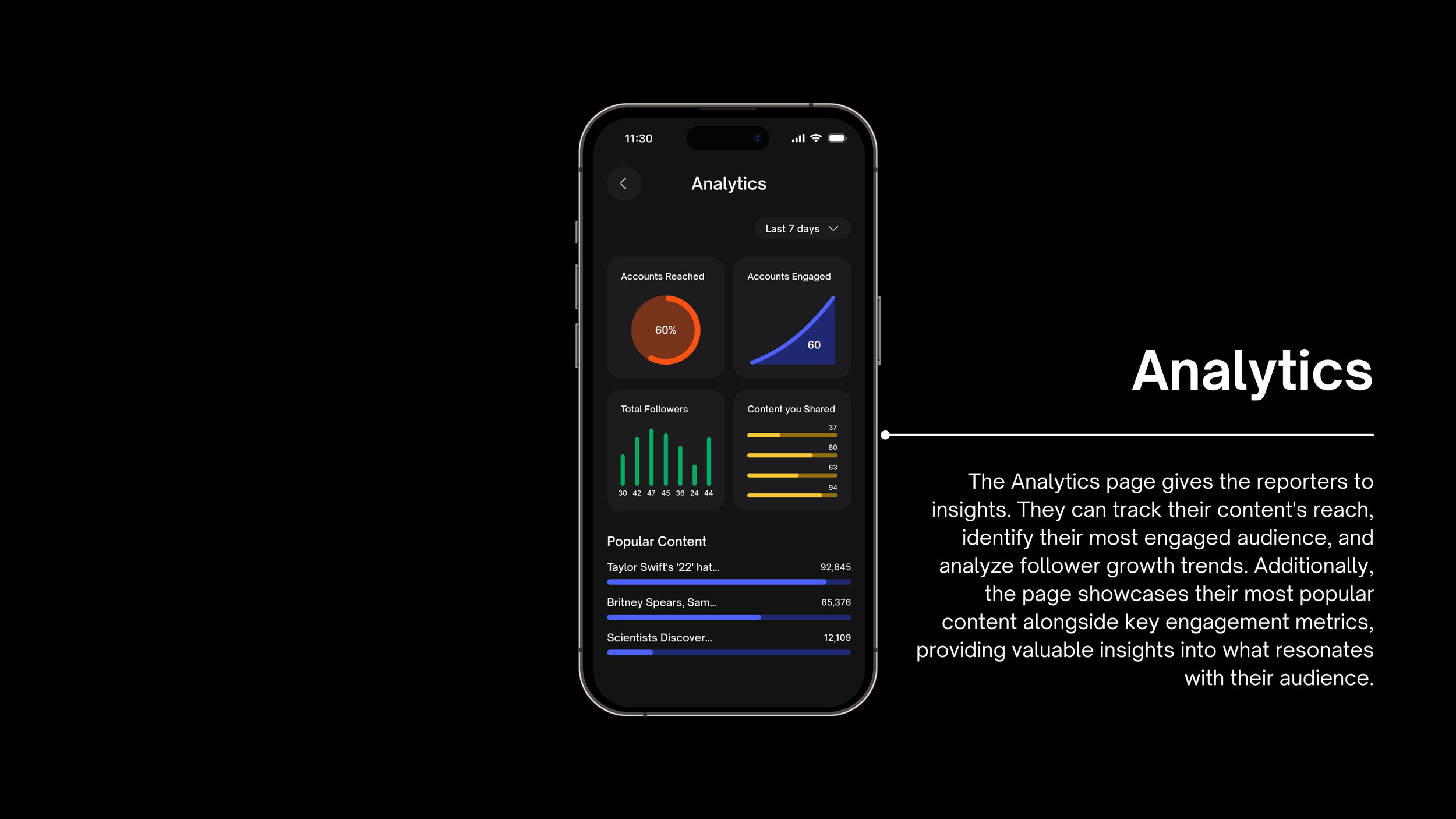
Reporters Core Features.
Impact
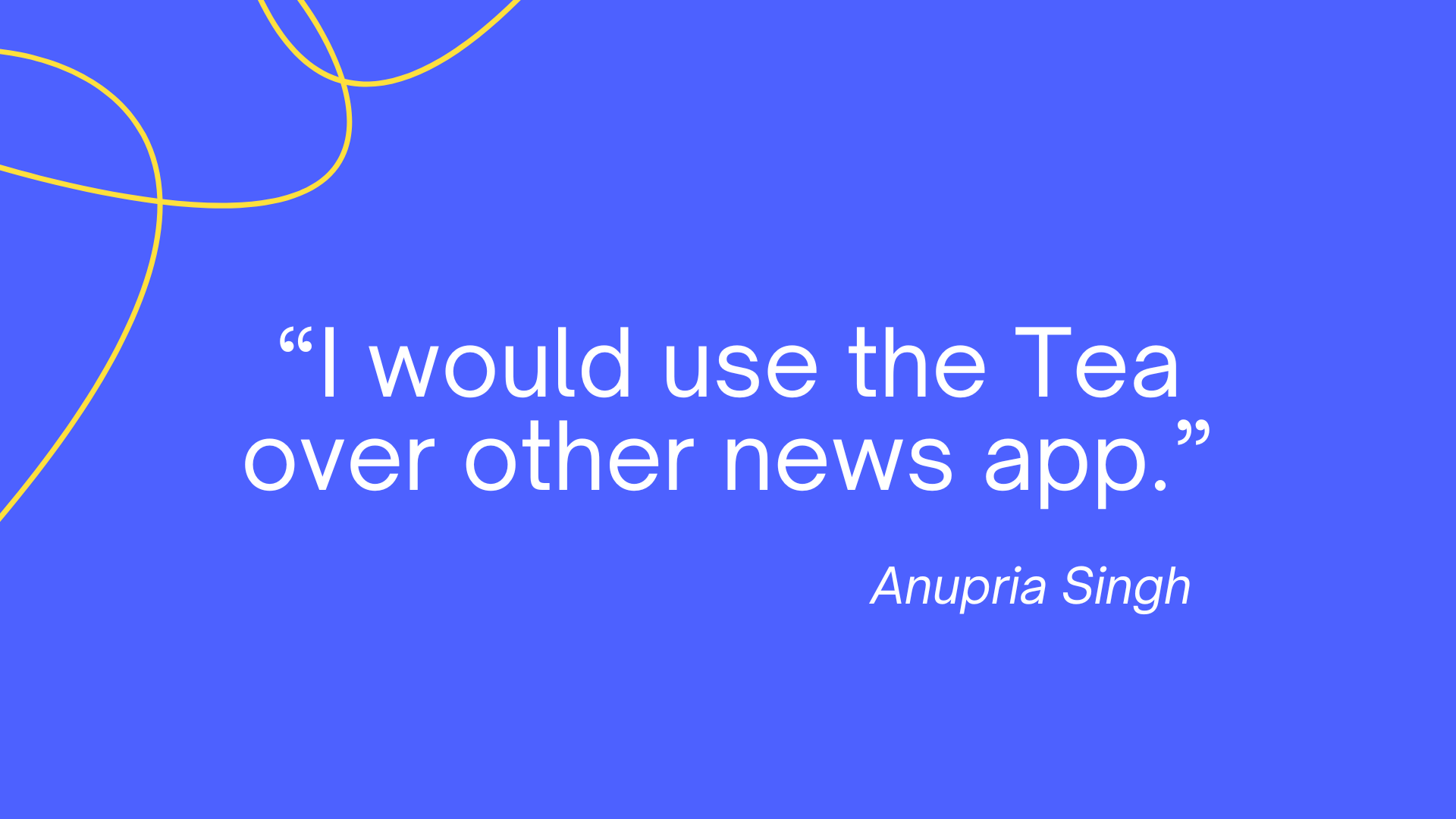
The Tea news app was very well received by Gen Z users, with 78% preferring it over other news platforms.
Gen Z users reported that the app helped them stay informed on both local and international news events, with 92% saying they felt "up-to-date" on current affairs.
User retention rates for the Tea app were 25% higher than other leading news apps targeted at the Gen Z demographic.
Research
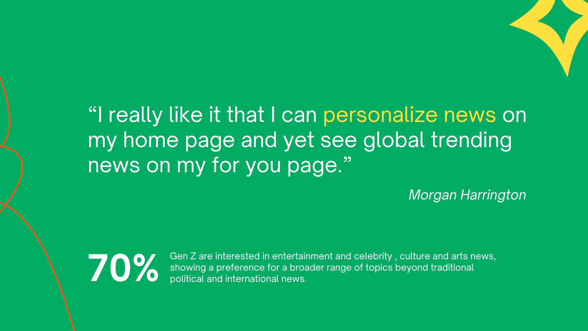
The research process is a combination of online surveys, and in-depth interviews across diverse segments of Gen Z. This comprehensive approach not only validated our initial insights but also brought new perspectives into the evolving needs and challenges faced by young news consumers today.
39 %
Respondents said they are not very informed about news.
76 %
Respondents said they spend less than 15 minutes consuming news.
42
Online Respondents
11
Interview Sessions
100%
Respondents said they use social media platforms like TikTok/Instagram for news.
Competitive Analysis
I did the Competitive analysis of mainstream news apps targeting Gen Z. The goal was to understand their target audience, Gen Z appeal, content focus, engagement features, personalization, accuracy, and moderation, in order to discover potential opportunity areas for the product.
Strong local engagement but limited personalization and potential for misinformation.
High personalization and engagement but variable content accuracy.
High accuracy and curated content but lacks user control and engagement.
High Gen Z appeal and engagement but focuses more on entertainment than news.
Information Architecture
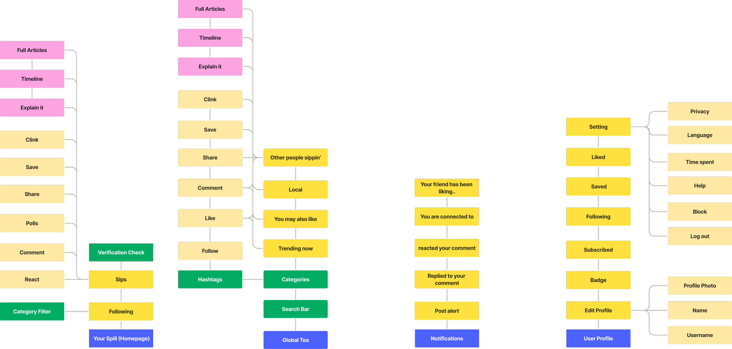
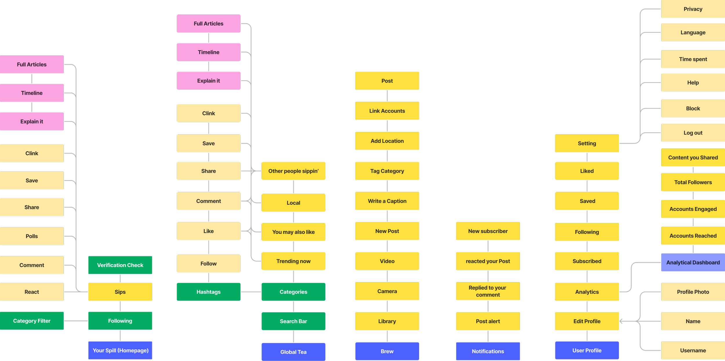
I designed the app’s information architecture for Gen-Z news readers and reporters, based on their mental models to enhance navigation. The process involved:
User Research: Conducted interviews and surveys with Gen-Z users to understand their news consumption habits and preferences.
Mental Model Analysis: Studied how Gen-Z users conceptualize and organize news content, identifying common patterns and expectations.
Content Audit: Analyzed existing news content to determine categories and relationships.
Card Sorting: Engaged users in organizing content categories to inform the app's structure.
Navigation Design: Created a hierarchical structure and navigation system based on research findings.
Gen z - Explorer IA
Reporter IA
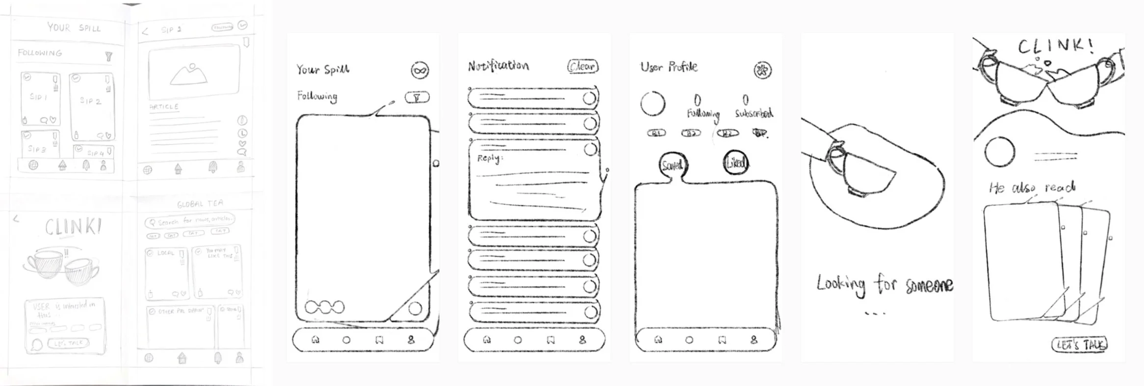
Low-Fi Screens
Led ideation for low-fidelity wireframes using the Crazy 8s technique. Team members generated 8 unique concepts each, with the best ideas selected for mid-fidelity wireframe development.
Iterations with Usability Tests
I conducted 3 rounds of RITE (rapid iterative testing and evaluation) to receive feedback and iterate the prototype quickly.
User Testing 1
Gen z - Explore
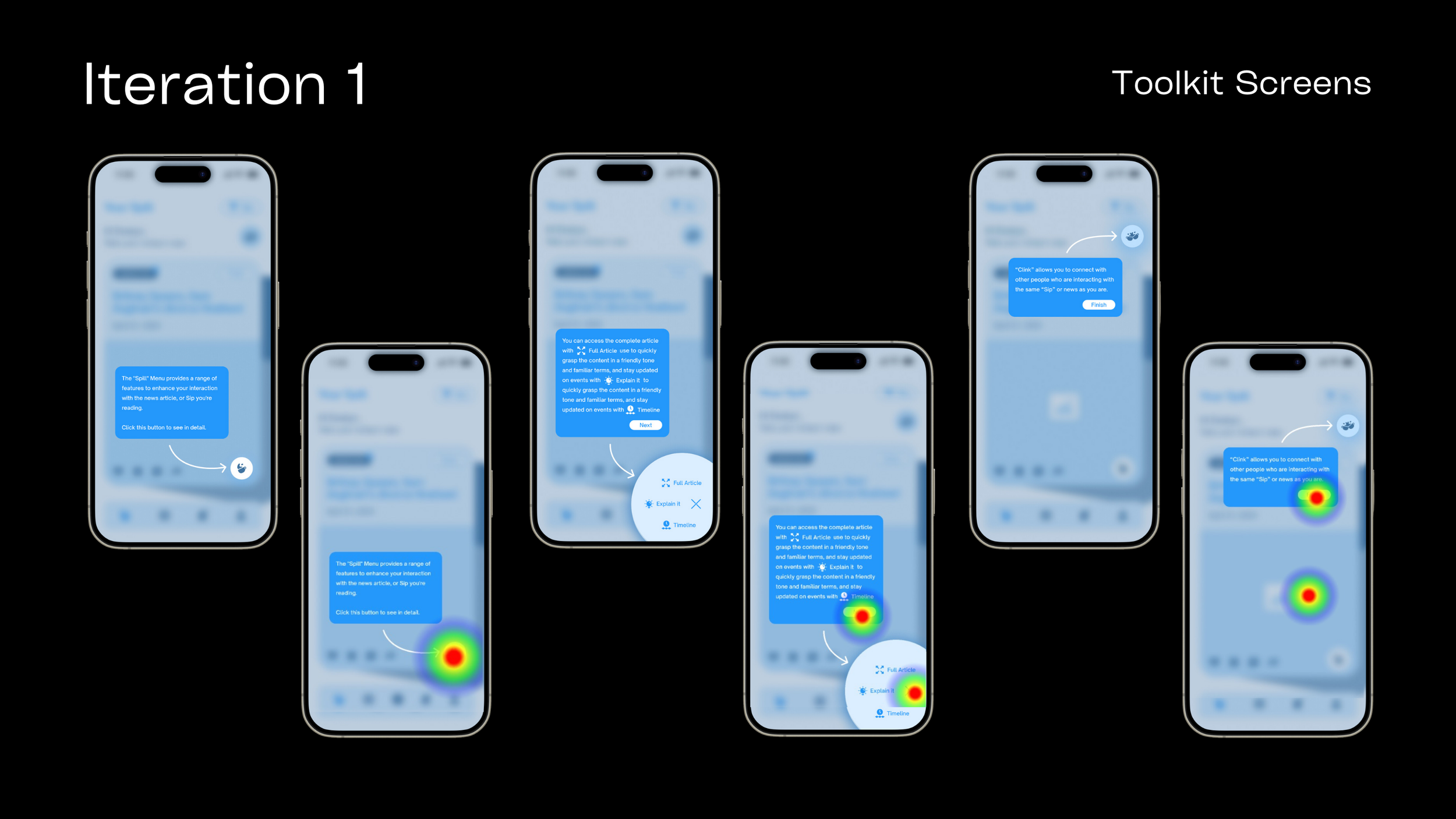
None of the users could locate the "Spill" Menu, leading to their inability to access other features like the Full Article, Timeline, and Explain It.
The users would appreciate being onboarded to understand the features and their purposes.
User Testing 2
Gen z - Explore
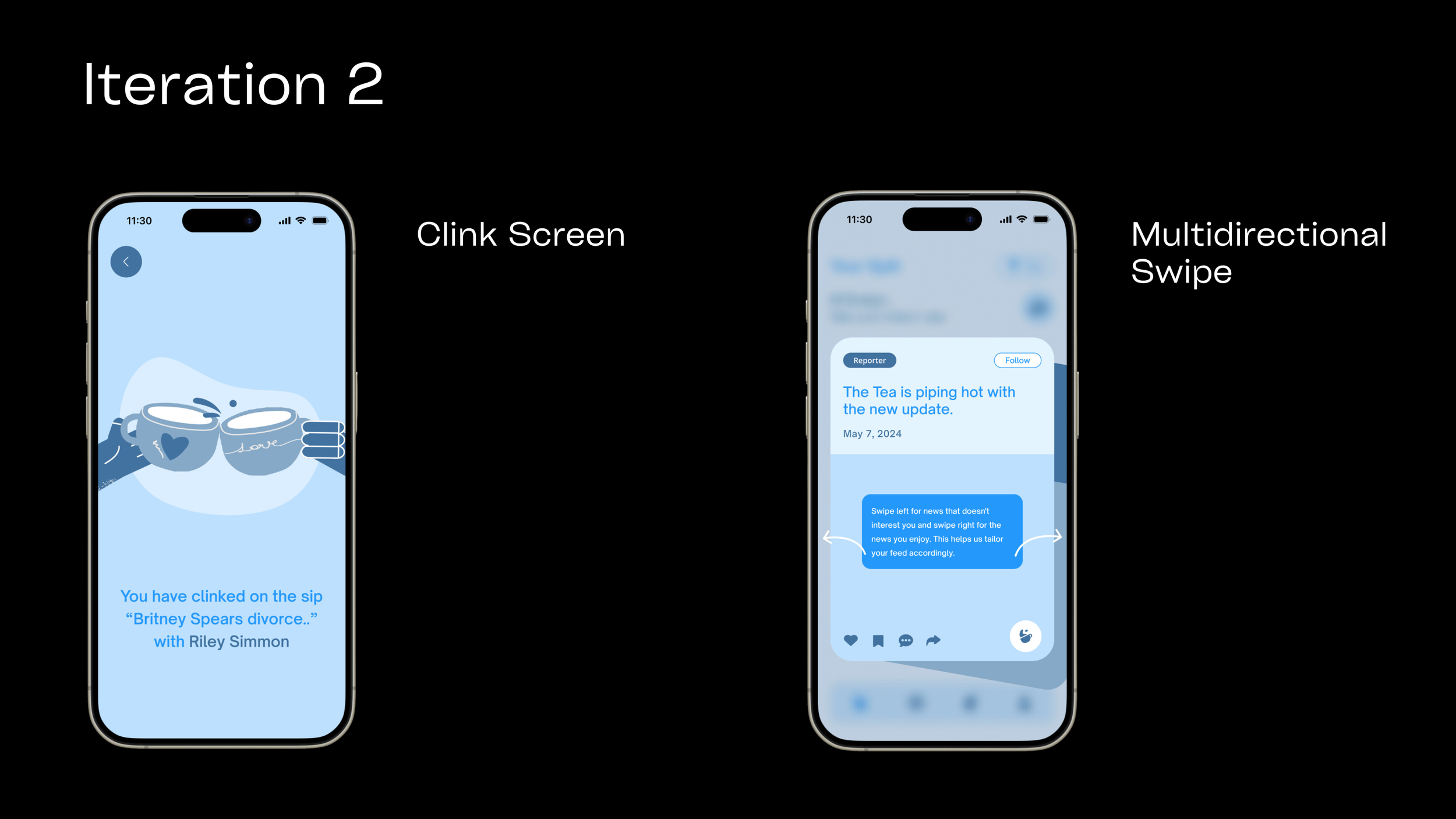
Users were unaware of which news articles they matched or “Clinked” on with other users.
Users wanted to dislike the articles that they weren’t interested in.
User Testing 3
Gen z - Explore
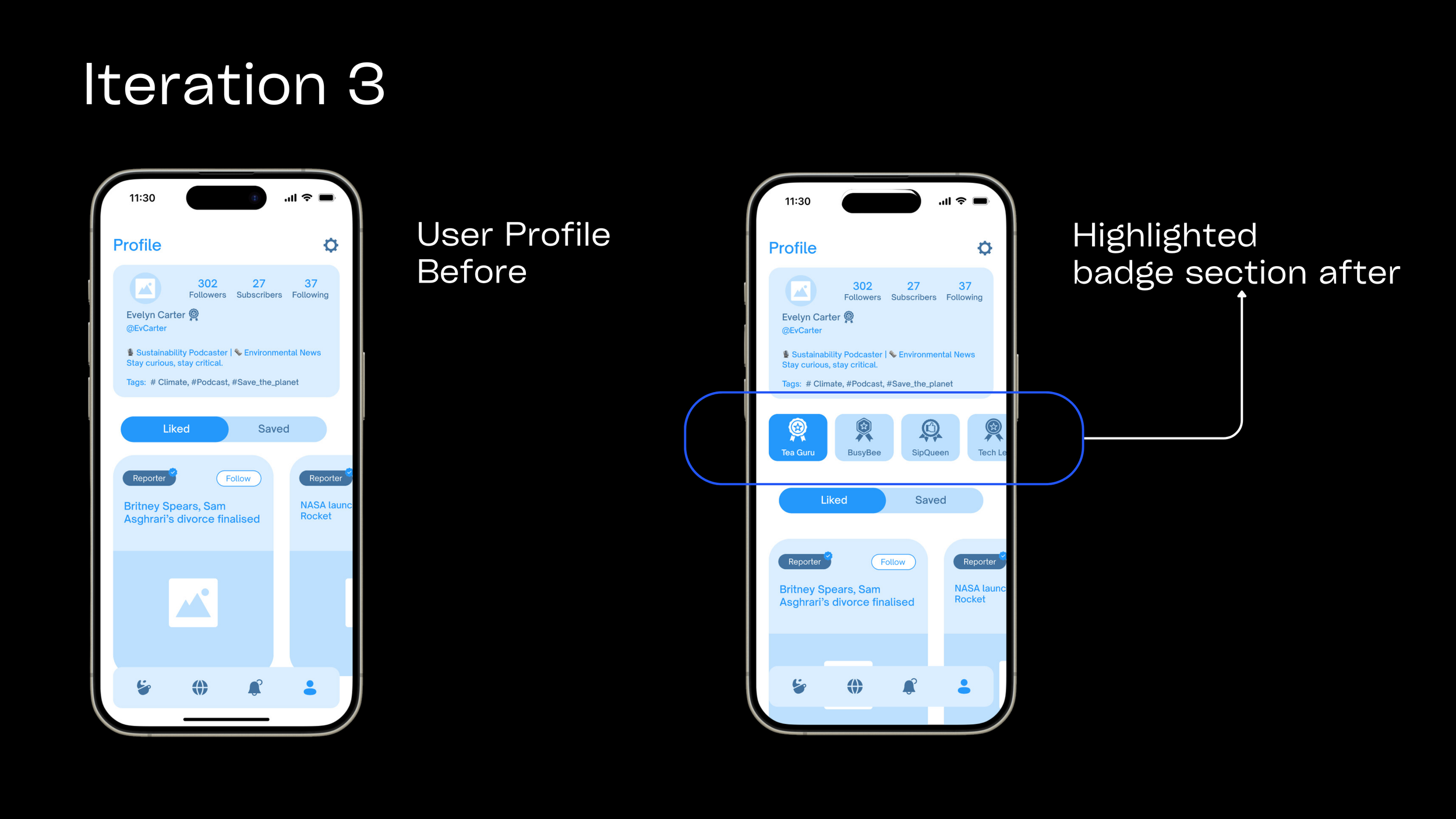
Users complained about not knowing how to earn or get a badge on their profile.
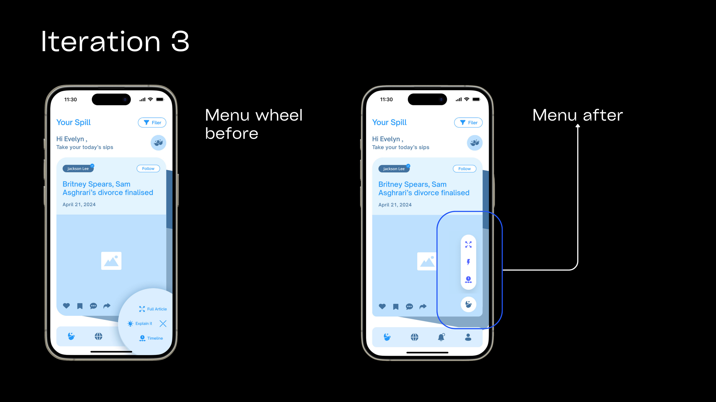
They felt the menu wheel was too distracting while using the menu.
Changes
Onboarding Screens:
Implement a series of visually appealing and informative onboarding screens for new users.
Each screen should introduce a key feature or aspect of the app in a concise, engaging manner.
Include interactive elements to allow users to explore features as they learn about them.
Changes
Develop a dedicated toolkit section within the app.
Create clear, concise explanations for the menu structure and navigation.
Provide a detailed guide on how to use the 'Clink' feature, including its purpose and benefits.
Use a combination of text, icons, and possibly short animations to illustrate app functions.
Changes
Highlight the specific news article both users were reading.
Introduce the 'Clink' feature as the means of connection for users reading the same news.
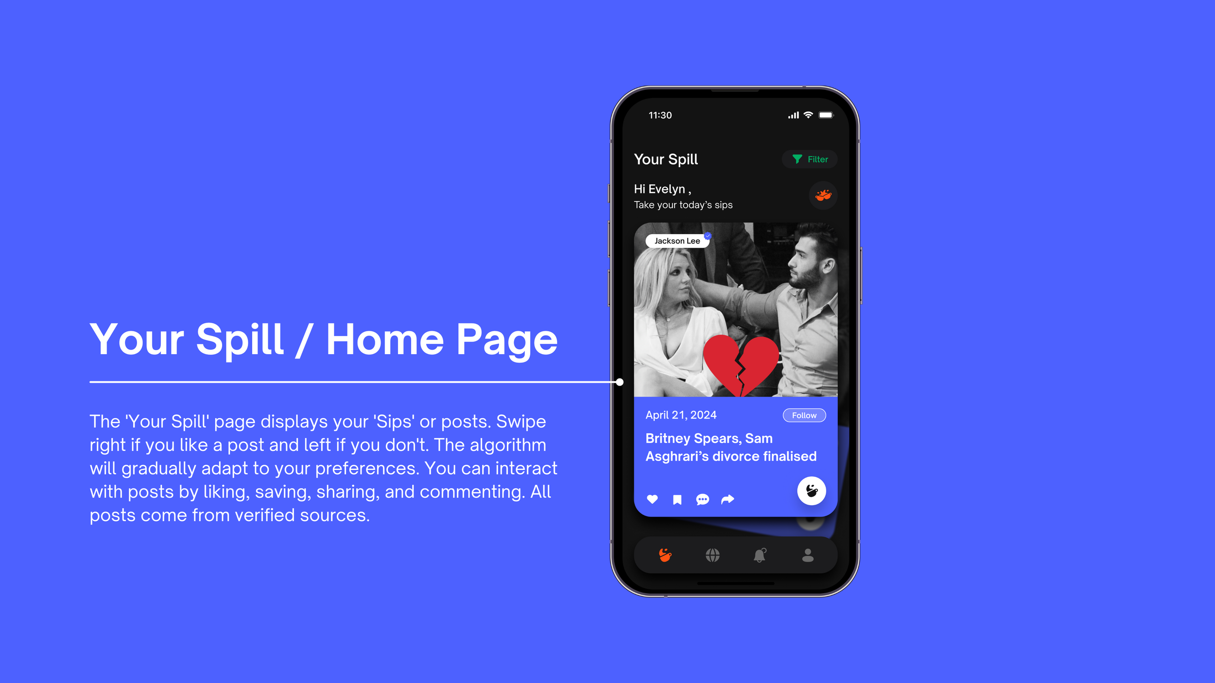
For the 'Your Spill' page, implement a multidirectional swipe feature:
Right swipe: For news articles the user likes.
Left swipe: For news articles the user doesn't like.
Changes
Highlight badges in the user profile section of the app. This feature should:
Display all badges the user has earned so far by consuming news through the app.
Show a clear visual representation of each earned badge.
Include a section that previews badges the user can unlock in the future.
Changes
Redesign the menu interface to replace the wheel shape with a more sleek and less distracting design. The new menu should:
Adopt a minimalist, streamlined appearance that blends seamlessly with the app's overall aesthetic.
Utilize a subtle, unobtrusive design that doesn't compete for attention with the app's main content.
Brand Identity
Style Guide
I Designed the brand identity and style guide, focusing on Gen Z appeal. Incorporated app's personality through:
• Informative yet humorous tone
• Graphic elements adding 'pop'
• Bright color palette to set the mood
This approach ensures a vibrant, engaging experience aligned with Gen Z preferences.
Final solution prototype
Vision Video
My Role & Takeaways
I was the lead UX designer and researcher driving this project from concept to implementation. As the product owner, my key responsibilities included:
My Contributions:
Conceiving the core concept of the application.
Building the information architecture and creating the wireframes to bring the innovative user experience to life
Conducting in-depth user research and testing to ensure a seamless and engaging experience
My Key Takeaways:
The transformative power of creative thinking: By embracing unconventional approaches, we were able to create a groundbreaking solution that earned outstanding recognition.
The importance of information architecture: Developing clear, concise wireframes and design diagrams was far more efficient and effective than relying on textual descriptions.
The value of research & design: Closely listening to the real voice of the user was instrumental in helping me narrow down the problem and arrive at the final solution.
The benefits of cooperation & communication: Working in an interdisciplinary team provided valuable perspectives from outside my own area of expertise, which will inform my approach to future collaborations.
